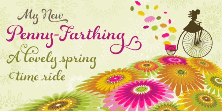

I absolutely love using a pointed brush for lettering. The lushness and sensuality of a brush can create thick and round shapes that quickly turn into hairline thin strokes with a flick of the wrist. The flexibility and broad range of styles that can spring forth from the brush is incredible, and this new design, Rosarian, was born from this experience.
While creating the lettering for Rosarian, interesting forms came to life through the manipulation of the brush. The curvy stems on the letters a, g, u, for example, was a result of looping the brush around to create the down-stroke rather than lifting the brush off of the surface to join two strokes together. Instead of attempting a consistent contrast, I put a little more emphasis on the bottom part of the stroke to keep the look lively, playful and a bit retro. The addition of 215 alternates and 10 ornaments allows for a wide variety of looks, the use of contextual alternates keeps it looking ideal and enabling Stylistic Alternates switches the design to an unconnected script for a more informal appearance.
Font Family: