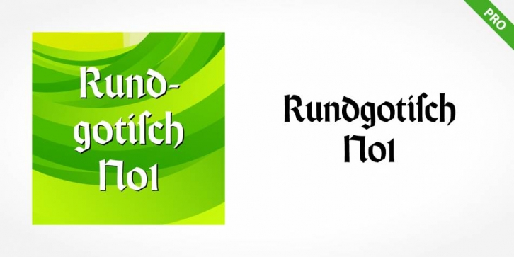

In their catalog for the typeface, Bauer began with this quote from Leonhard Wagner: The round gothic (rundgotisch) script is the most beautiful kind of script; she is called the mother and the queen of all the rest.â€â€œ
Rundgotisch No1 Pro design is inspired by Renaissance types cut by the Augsberg printer Erhard Ratdolt. Ratdolt had spent some time in Venice, which is most likely where he became familiar with round gothic letters. This sort of letterform was never as popular in Germany as Fraktur or Gotisch may have been, but round gothic types were used there for centuries to represent arts and craft feelings, as well as old-fashioned handwork.
For a blackletter typeface, Rundgotisch No1 Pro is very similar to normal serif and sans serif designs, especially its uppercase letters, which seem to have some uncial influence in them as well. Therefore, Rundgotisch No1 Pro is more legible for contemporary readers, making this an excellent choice for anyone looking to set text, logos, or headlines with in blackletter.
Blackletter, Blackletter layout, Broken Face, Broken faces, Calligraphic, Calligraphy, CE, Central European, Com, DFR, long s, OpenType, OT, Rotunda
Font Family: Rundgotisch No1 Pro Regular