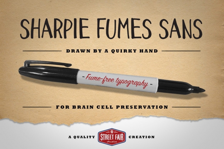

Say hello to Sharpie Fumes Sans, the proud sibling to Sharpie Fumes Mono. This font was developed from countless advertising thumbnail sketches over the years. Just a tad more refined than Mono, this font features a subtle thick/thin relationship in the characters, but also has an imperfect edge to it. You'll notice that thickness in the vertical strokes, as well as the curves.
Sharpie Fumes Sans strikes the perfect balance between seriousness and playfulness, an "everyman" font, if you will. Pair it with bold sans serifs or slab serifs for a nice type combination.
Available in otf format.
Have fun with it, let me know what you think, and share any examples of usage with me and the Creative Market community.
Guess the movie I'm quoting from in the examples (same as Sharpie Fumes Mono) for a virtual pat on the back.
