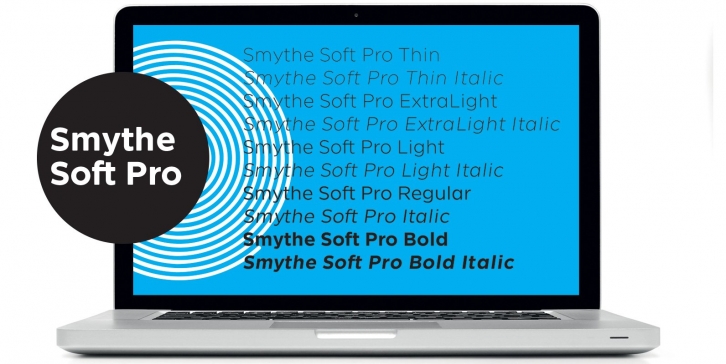

SmytheSoft Pro is a contemporary workhorse sans serif family that is eminently readable on-screen and in print. It is an updated display version of our popular family Smythe Sans with custom rounded terminals, rigorously spaced and kerned. SmytheSoft Pro includes Western, Central and Eastern European and Vietnamese character sets and is offered in five Roman and Italic weights: thin, ultra light, light, regular and bold.
SmythSoft Pro features a large x-height, ample yet economic spacing for capitals, and subtle ink traps for less-than-perfect printing conditions (which can be exploited as design features at large scale). All of the capitals from the old Smythe Sans Display family are folded in to SmytheSoft Pro as OpenType accessible stylistic alternates—NASA-inspired space age alternate caps galore! The original Smythe Sans family featured Italic and Oblique cuts—in SmytheSoft Pro, the more calligraphic italic characters are available via OpenType-accessible stylistic sets. Each weight of SmytheSoft Pro features a bespoke paragraph mark which varies from weight-to-weight and includes over 100 ornaments, kinetic rules, symbols and pattern-making glyphs so that one might use SmytheSoft Pro as a complete design kit.
The members of the SmytheSoft Pro family: SmytheSoft Pro Thin SmytheSoft Pro Thin Italic SmytheSoft Pro ExtraLight SmytheSoft Pro ExtraLight Italic SmytheSoft Pro Light SmytheSoft Pro Light Italic SmytheSoft Pro Regular SmytheSoft Pro Italic SmytheSoft Pro Bold SmytheSoft Pro Bold Italic
The lighter weights are slightly slimmer than the regular and bold weights to give the typeface more of a vertical feel, inviting readers' to rapidly read typeset text with a maximum of contrast and a minimum of optical dazzle. All work well on-screen as webfonts and in print as book type. Each is hinted with accuracy and kerned with precision.
SmytheSoft Pro is an eminently readable typeface, particularly at small sizes on-screen. The strokes throughout are modulated to enhance humanist expression, with high-contrast horizontal slices taken out of certain letterforms to keep readers' eyes moving forward in text. The typeface's tendency toward a tall x-height was carried through the single-storied font with more horizontal characteristics for enhanced readability while being super-friendly and bright in appearance.
Features of SmytheSoft Pro:
