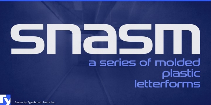
Snasm was designed by Ray Larabie and published by Typodermic. Snasm contains 12 styles and family package options.
The Snasm font family is an augmentation of some of the ideas employed in late 20th Century modular letterforms including the instrumental typeface designs of Donald Handel. From the late seventies to the early 1990s, there was a logo trend using correspondingly laconic, molded plastic forms. The Pepsi Cola (1987) and Nintendo Super Famicom (1990) logos are good examples of this smooth, high-tech design tactic.
In Snasm, I used spartan, stabilized capitals and integrated them with a spacious lowercase. The payoff is a design which harmonizes with up-to-the-minute electronics gadgetry and current user interface trends. Snasm comes in an advantageous range of weights as well as a set of fastidiously crafted obliques.
Font Family:
· Snasm ExtraLight
· Snasm ExtraLight Italic
· Snasm Light
· Snasm Light Italic
· Snasm Book
· Snasm Book Italic
· Snasm
· Snasm Italic
· Snasm Bold
· Snasm Bold Italic
· Snasm Heavy
· Snasm Heavy Italic
File Size: 6.72 MB
Tags: futuristic,
square,
technoRelease date: January 14, 2013
You can use this font for:
- Design projects: create images or vector artwork, including logos
- Website publishing: create a Web Project to add any font from our service to your website
- PDFs: embed fonts in PDFs for viewing and printing
- Video and broadcast: use fonts to create in-house or commercial video content and more
- The fonts are designed to work on MacOS (Apple) and Windows (Microsoft)
Preview:

