Southwark was designed by David Kerkhoff and published by Hanoded. Southwark contains 2 styles and family package options.
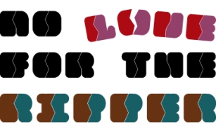
London is one of my favourite cities, so it was about time I named a font after it. Well, technically, I named a font after one of London's districts. Southwark comes from the Anglo-Saxon word Suthriganaweorc, which means 'Fort of the men of Surrey'. The font Southwork is a handmade Clarendon. I used a Japanese brush pen to create the outlines. I gave the glyphs texture by filling them in with a brush and Chinese ink. Southwark, therefore, has an uneven look and a brushy texture. It looks good on just about anything, but posters, greeting cards and product packaging come to mind.
Font Family:·
Southwark Regular·
Southwark ItalicFile Size: 2.5 MB
Tags: all caps,
baskerville,
bold, book cover,
brush,
brushed, brush texture, caps,
caslon,
clarendon,
clear,
display,
eroded,
fat, film poster, hand drawn, hand made,
handmade,
ink,
legible,
loud,
messy, movie poster,
multilingual,
obese, old style,
packaging, product packaging,
rough,
scribble,
scribbled,
serif,
title,
titling,
transitional,
uniqueRelease date: November 13, 2017
You can use this font for:
- Design projects: create images or vector artwork, including logos
- Website publishing: create a Web Project to add any font from our service to your website
- PDFs: embed fonts in PDFs for viewing and printing
- Video and broadcast: use fonts to create in-house or commercial video content and more
- The fonts are designed to work on MacOS (Apple) and Windows (Microsoft)