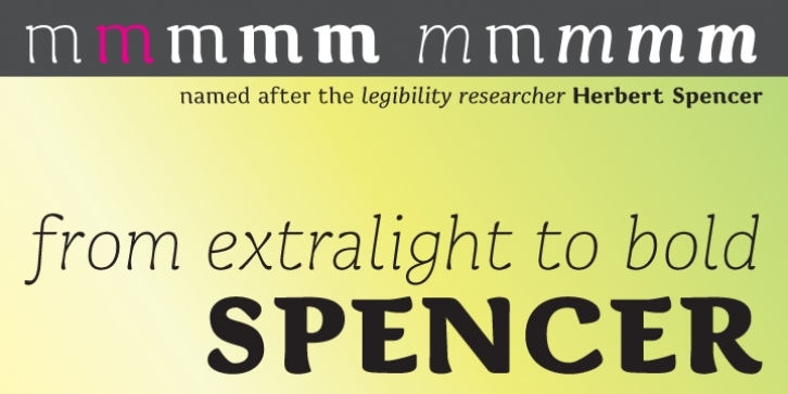
The typeface is named after Herbert Spencer who ran a series of legibility studies at The Royal College of Art in the sixties and seventies.
An early version of Spencer was subjected to experimental legibility investigations of distance and time threshold methods*. Participants were exposed to different variations of the most frequently misread lowercase letters within the typeface. The findings, demonstrated that the two-storey ‘a’ has a higher visibility than the one-storey ‘a’, that the upper part of the bowl of the two-storey ‘a’ should be round and not diagonal, that a long tail on ‘j’, ‘l’ and ‘t’ enhances visibility from a distance, and that the same goes for a serif on top of the stem of ‘i’. Yet, as pointed out by Walter Tracy in his book Letters of Credit, an extraordinarily wide lowercase ‘l’ could have a negative influence on the important word pattern. Nonetheless, one must assume that this only goes for situations in which another letter is placed to the right of the ‘l’, and not when the ‘l’ is the last letter of a word. The lowercase ‘l’ of the typeface Spencer is therefore narrow when a character follows directly after, and broader when it is followed by a space.
In a legibility study of 1973, the researcher John Harris found that serifs on the lowercase counters appear to lower legibility. In the typeface Spencer, serifs are therefore removed from the counters. To further enhance the differentiation of ‘b’ and ‘h’, the right stem of characters ‘h’, ‘n’, ‘m’ extend in an arc to the right, which ideally should enhance the horizontal flow of the font as well. To avoid the misreading of ‘D’ as ‘O’, the stroke of the bowl extends to the left of the stem in the upper part of the ‘D’. For harmony the feature is also applied to other uppercase characters with a horizontal upper stroke (B E F P R). The possible problem of misreadings between ‘R’ and ‘B'’ is accommodated for by an arc attached to the right of the leg of the ‘R’ – the arc is further applied to the other similar shaped characters: ‘A’, ‘K'’ and ‘k’.
* Beier, S. & Larson, K. (2010) ‘Design Improvements for Frequently Misrecognized Letters’, Information Design Journal, 18(2), 118-137
File Size: 2.7 MB
Tags: calligraphic, some-serifs
Release date: August 10, 2011
You can use this font for:
- Design projects: create images or vector artwork, including logos
- Website publishing: create a Web Project to add any font from our service to your website
- PDFs: embed fonts in PDFs for viewing and printing
- Video and broadcast: use fonts to create in-house or commercial video content and more
- The fonts are designed to work on MacOS (Apple) and Windows (Microsoft)
Preview:

