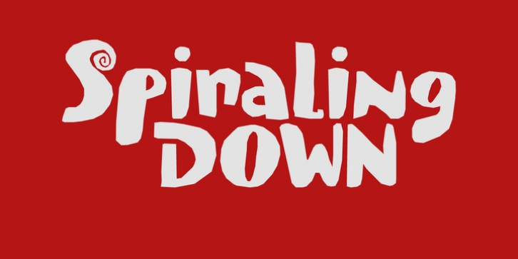
Spiraling Down was designed by David Kerkhoff and published by Hanoded. Spiraling Down contains 2 styles and family package options.
I was listening to an Opeth album called Blackwater Park. By the time I had decided that this font needed some swirls, the band was playing a song called The Drapery Falls - which has the word 'spiraling' in it (see poster 2) - and the name was born.
Spiraling down is a surprisingly elegant font (given its roughness). I probably wouldn't set a whole text in it, but it will really stand out as a titling font for packaging or book covers.
Font Family:
· Spiraling Down Regular
· Spiraling Down Italic
File Size: 9.34 MB
Tags: bold, book cover,
cool,
decorative,
design,
display, eyecatcher, eye catcher, eye catching,
fun, hand drawn,
handmade,
headline,
legible,
magazine,
multilingual,
outstanding,
packaging,
poster,
product,
quirky,
recognisable,
rough,
uneven,
unusualRelease date: April 4, 2019
You can use this font for:
- Design projects: create images or vector artwork, including logos
- Website publishing: create a Web Project to add any font from our service to your website
- PDFs: embed fonts in PDFs for viewing and printing
- Video and broadcast: use fonts to create in-house or commercial video content and more
- The fonts are designed to work on MacOS (Apple) and Windows (Microsoft)


