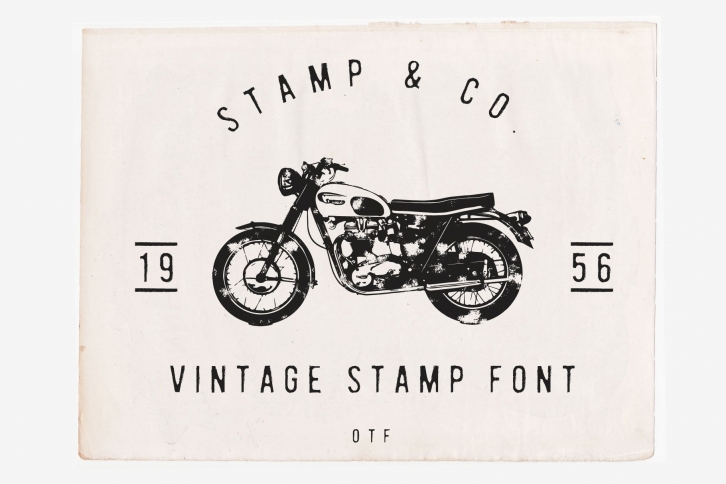

I was in Sri Lanka on the old english rail system when I got a $2 "fine" for my luggage (surfboard) being too big for the luggage space. The ticket hadn't changed since the 1950s and still used an old stamp with an official rail font. The fact that the stamp was so old gave the text a perfect subtle irregular border. This font I have made is based on that design. It is clean yet textured, like a stamp that quite didn't get enough ink.
want this font cheaper? get it in the vintage super bundle along with heaps of extras. click below! https://creativemarket.com/NewTropical/2672012-The-vintage-logo-font-super-bundle
