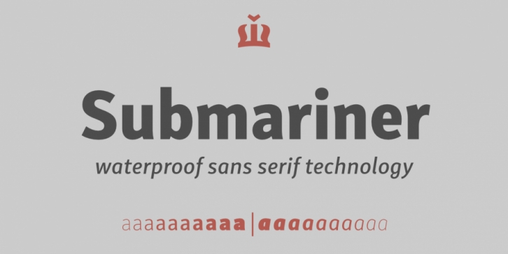

Submariner is a friendly type family that displays the right amount of power and character on every depth level. It can endure great information pressure thanks to its strong and elegant construction. Some letters have more to show, but do not affect the stability of the whole. All components are assembled to carry enough whiteness and they work together in greater harmony, making Submariner an amazing typographic experience.
Submariner has a familiar look and feel. Its humanistic construction is enhanced with comfortable details and carries a friendly and reliable appearance. The letter construction is more open and endings are slight wider, increasing the readability of long texts. It also makes Submariner highly suitable for texts, information graphics, annual reports, signs, headers and other inscriptions.
The typeface’s x-height is exactly 70% of its capitals. Ascenders are a little taller than capitals, making the letters very readable and recognizable. Submariner italic is constructed at 9° angle. It gives neutral appearance and it’s still very recognisable.
It is recommended for high-density information designs like annual reports as well as for, signs, headers and other inscriptions.
Font Family: