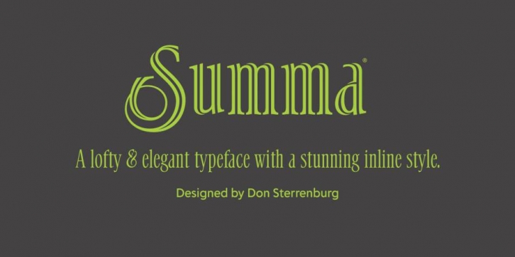

Don Sterrenburg is truly a master with pen and ink. His wealth of knowledge and considerable experience were brought to bear in creating Sterrenburg’s first digital typeface, Summa. Delve Fonts worked very closely with Sterrenburg for years to diligently transform his magnificent pen and ink drawings on illustration board into modern font software, sending type specimens and early versions of working fonts for review and then faithfully completing the revisions he requested after carefully examining the materials.
“There was real excitement with the arrival of each shipment of new art from Don,†relates Delve Withrington, principal at Delve Fonts. He continues: “It was a pleasure to work with Don because the physical artwork he prepared for production of the digital typeface was confident, and precise — leaving no room to misinterpret the intent.â€
The resulting typeface is a testament to the effort of everyone involved. The classic roman spirit and bracketed, cupped serifs together with the narrow width and elevated x-height of Summa give it a lofty, elegant appearance and an economic use of space. The ‘true italic’ counterpart style — not simply slanted or oblique — with its more calligraphic form is a well-balanced and thoughtful adaptation of the regular design.
Summa Inline is a fascinating stylistic variation that takes the design of Summa to another place entirely. It is a complete re-imagining of the structure of the forms found in the regular. The inline seemingly twists in places, dropping out where strokes cross over each other creating an almost three dimensional, ribbon-like appearance. In addition, the inline variant of Summa includes a set of swash capital letters that allow designers to easily give their setting that extra little dash of calligraphic flare and exuberance.
Font Family: