
My affection for Slab Serifs began in the early 1960s in Kansas City when Rob Roy Kelly was at the Kansas City Art Institute, teaching and writing his book on American Wood Type. I got to know him just well enough to be allowed access to his fabulous collection of wood type and wood type catalogs.
Later, in the 1970s I tried to re-create an old Nebiolo Egiziano for Roger Black at New West Magazine. And, again for Roger, in the 1980s, I designed a Slab Serif logo for Newsweek Magazine.
Finally, in 2003 I started designing the Sutro Family. Over the last decade I have been dressing up the original fonts and adding a bunch of new ones.
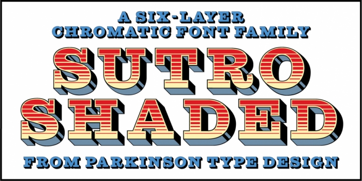
Sutro Shaded existed for a few years as a one color, outlined, drop-shadowed display font. It seemed like it was just dying for a little color. I added five more fonts: Fill, Gradient, Hatching, Rules and Hi-Lite. These fonts can be used in different combinations to achieve various effects.
Font Family: