
Even though we call them “quarterly taxes,” here in the USA the quarters aren’t even. Q1 is three months, then Q2 is only two months. Followed by a three-month Q3, and a four-month Q4. Why? It’s complicated, as all good tax issues are.
Due to the timing weirdness, I’ll often post a picture of my outgoing tax payment envelopes as a reminder to quarterly-paying friends that yet another deadline is near. And more than one person has commented that I should make a font out of the handwriting I use on outgoing mail.
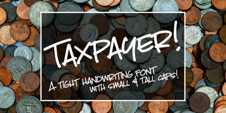
So, here it is! This is very close to my actual handwriting, especially when I’m addressing an envelope. I use all-caps, but I use taller caps as the “uppercase” and shorter caps as the “lowercase.”
Taxpayer contains all of the usual basics (A-Z, a-z, 0-9, plenty of punctuation), plus over 300 extended Latin characters for language support. And I’ve included 15 double-letter ligatures for the short (lowercase) caps, to add to the hand-written look. And every character has been cleaned up and smoothed a bit, to make it easy to use for both print and cutting machines!
Font Family: Taxpayer Regular