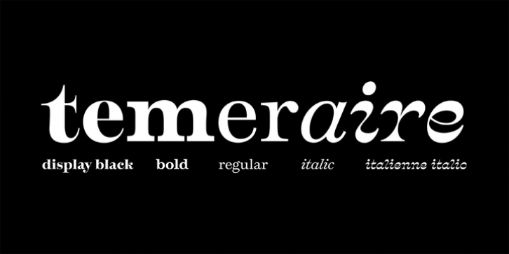

Most type families increase the weight of each character to expand the family. Instead, research into 17th century sources produced Temeraire's wide range of letterforms, from the predictable to the odd and loosely related through time. Each style is designed to work alongside the others but are also standalone homages to specific parts of English lettering tradition: gravestone cutting, writing masters' copperplates, Italiennes, and others.
Temeraire's Regular style is a contrast-loving Transitional Serif with vertical stress, making it great for period and classic works, ironic pieces, and modern throwbacks. The weight of the Bold squares off the ends of each glyph to give it stability, and the italic style rings true: flowing, contrasting, and purposefully inconsistent.
Temeraire's Display Black style is one salvaged from expressive gravestone artistry. The details most easily noticed are the 'g' with its descending bowl that has been pressed back up in the centre, and the additional serif on the 't' crossbar that holds its neighbouring character at bay. (The 'g' and 'Q' have loopless alternates.) The final style is the Italienne, the horizontally stressed counterpoint to the family. By design its characters flow and bend in ways not in step with the rest of the family. All the weight has been pushed to either hemisphere within each glyph, resulting in a display style that demands space and peacefulness around it so its presence can impress.
As with all TypeTogether families, Temeraire meets the current designer's needs. Not only does its five styles shine in print work, it includes alternates for when the defaults are too boisterous and has been expertly crafted for screens. The Temeraire serif font family is resurrected from echoes in time and finds its family relation through impeccable taste.
Font Family:
· Temeraire Regular
· Temeraire Italic
· Temeraire Bold
· Temeraire Display Black
· Temeraire Italienne Italic
File Size: 19.75 MB
