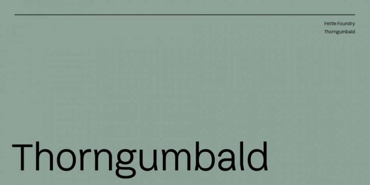

Thorngumbald is a playful sans-serif typeface designed to merge fun and legibility, reducing similarity between certain letters and increase readability for people with impaired vision. Thorngumbald comprises of a full regular weight that has been developed with over 600 characters, OpenType features, contextual diacritic kerning and many more features.
Inspiration for this typeface came from a personal and familial connection to poor vision and vision loss, as well as a strong desire to increase accessibility within design. Using intentional inconsistencies and altering glyphs that appear similar to each other, I hope that this typeface can be of use to designers and users looking for something legible that doesn’t sacrifice style.
Features:
– 654 character glyphs (compliant with Latin S)
– Uppercase, lowercase, numbers, numerators
– Ordinals and superiors
– Old-style and tabular figures
– Accented characters
– Ligatures
– Discretionary ligatures
– Contextual Ligatures
– Stylised Alternates
– Mathematical symbols, arrows, and other special characters
– OpenType features (aalt, ccmp, locl, subs, sinf, sups, numr, dnom, frac, ordn, lnum, pnum, tnum, onum, case, ss, dlig)
