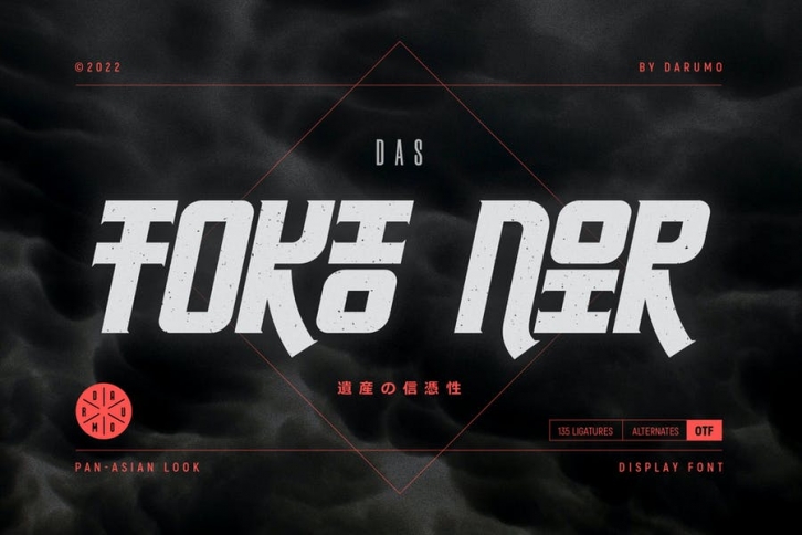

Introducing TOKIO NOIR, the eye-catching typeface with an Asian temper. Here's what the designer tells about this project:
"I always loved Asian (Japanese, Chinese, Korean) hieroglyphic writing where every character looks to me as a finished piece of calligraphic art. So, Tokio Noir is my try to reinvent Western writing using the Oriental approach. Asian pictorial emotionality on the one hand and thoughtful European pragmatism on the other. This is my attempt to bring two such different concepts into one."
This distinguishing typeface is specially designed for vivid and eye-catching headers. Perfect for catchy logo/emblem designs, package designs, etc. Have fun using it!
