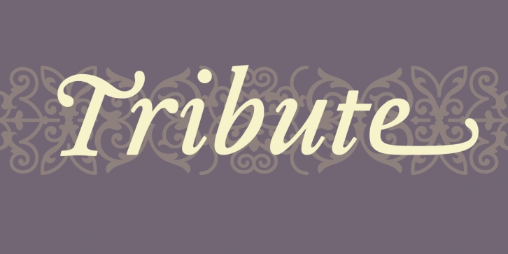
With the release of Tribute, Heine followed a path similar to that of Dalliance by using a single printed source (a photo copy of a reprint of a type specimen printed around 1565) as its model. The specimen in question was set in typefaces cut in 1544 and 1557 by the French punchcutter Francois Guyot. Not nearly as influential as his elders, such as Garamond or Griffo, Guyot’s unusual treatment of certain characters and overall idiosyncratic approach appealed to Heine’s aesthetic sensibilities. Also, to design a font based on a Renaissance Antiqua had been a long held desire for Heine, who said “I am particularly attracted to its archaic feel, especially with settings in smaller design sizes. It is rougher with less filigree than the types of the following centuries thus exhibiting much cruder craftsmanship of the early printing processes.†By using a third generation copy as a model, which did not reveal much detail, allowed Heine enough room for individual decisions resulting in a decidedly contemporary interpretation while maintaining a link to the past.
Fellow type designer and sign painter John Downer describes the result as follows: “It is evident that Frank Heine’s Tribute possesses an element of ‘type caricature’ in its drawing, but this fact doesn’t relegate it to that one category. Heine has really gone beyond parody, well into an area of personal exploration. He has challenged many traditional assumptions that we connoisseurs of hand-cut type have maintained in our attitude toward the historical accuracy sought and loved and expected in revivals. The result is a unique combination of caricature, homage, alchemy, and fanciful reinterpretation. Tribute, I think, recalls Guyot’s native French-learned style, primarily as a point of departure for an original—albeit implausible—work of historical fiction, with merits and faults of its own.
—–
Download the PDF here
Emigre Fonts is a digital type foundry and publisher of type specimens and artist books based in Berkeley, California. From 1984 until 2005 Emigre published the legendary Emigre magazine, a quarterly publication devoted to visual communication. The Emigre font library features more than 600 original typefaces, including Mrs Eaves, Brothers, Matrix and Filosofia.
Supported languages: German, Spanish, Dutch, English, Polish, Russian, French, Czech, Swedish, Portuguese, Catalan, Italian, Slovenian, Maltese, Arabic, Devanagari, Greek, Gujarati, Gurmukhi, Hebrew, Chinese (hk), Japanese, Korean, Tamil, Chinese (Traditional), Chinese (Simplified), Turkish, Hungarian, Vietnamese, Bengali, Kannada, Cherokee, Thai, Armenian, Belarusian, Danish, Macedonian, Ukrainian, Norwegian, Serbian, Telugu, Malayalam, IPA, Latvian, Chinese Pinyin, Finnish, Filipino, Malay, Croatian, Kazakh, Romanian, Persian, Indonesian, Slovak, Hindi
File Size: 7.12 MB
Release date: June 22, 2016
You can use this font for:
- Design projects: create images or vector artwork, including logos
- Website publishing: create a Web Project to add any font from our service to your website
- PDFs: embed fonts in PDFs for viewing and printing
- Video and broadcast: use fonts to create in-house or commercial video content and more
- The fonts are designed to work on MacOS (Apple) and Windows (Microsoft)


