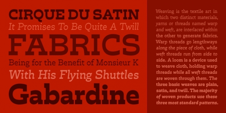
The 19th-century French Clarendon, with its unorthodox reversed stress, never achieved the versatility of its Victorian siblings: the slab-serif Antique and the sans-serif Grotesque.
In Trilby, David Jonathan Ross reined in this topsy-turvy style, cultivating its formal essence. Unburdened of excess ornamentation, Trilby transcends mere novelty as a wholly useful contemporary design with offbeat charm and subtle wit.
Among other uses, Trilby is recommended for Magazine use.
File Size: 7.22 MB
Tags: french clarendon, friendly, manicule, playful, reverse contrast, slab serif, top heavy
Release date: February 24, 2010
You can use this font for:
- Design projects: create images or vector artwork, including logos
- Website publishing: create a Web Project to add any font from our service to your website
- PDFs: embed fonts in PDFs for viewing and printing
- Video and broadcast: use fonts to create in-house or commercial video content and more
- The fonts are designed to work on MacOS (Apple) and Windows (Microsoft)
Preview:

