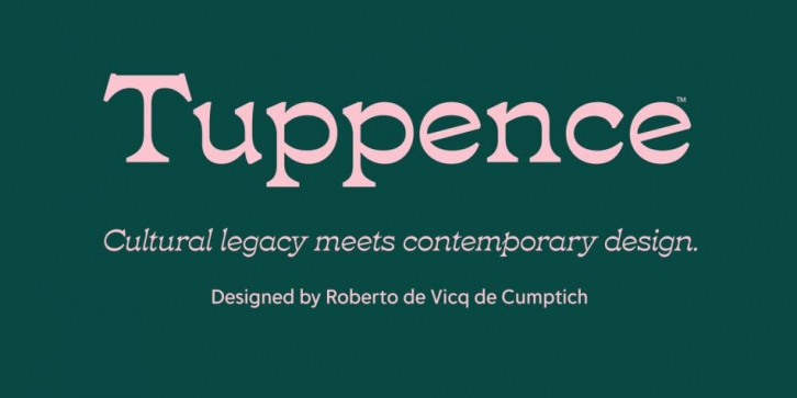

Inspired by the design of the London foundry Stephenson Blake typeface Blackfriars, designer Roberto de Vicq de Cumptich saw real potential for the design to be reinterpreted in a manner that today’s designers will find more useful. de Vicq’s vision for the design was to bring a more graceful appearance to the forms and explore its reversed contrast nature with additional weights.
The proportions of the lowercase letters in Tuppence are decidedly wider overall, allowing for a more geometric appearance and increasing the typeface’s contemporary appeal. Some of the less refined details were omitted and optical weight distribution improved.
Tuppence includes a marvelous selection of catch words, swash capital letters and ligatures, plus over a hundred beautiful ornaments, symbols, and arrows perfect for carrying the elegant aesthetic over into other areas of your design.
Tuppence retains the warmth and craftsmanship from its English primogenitor of the Victorian era. When considering its application, picture Tuppence in places like food and beverage labels, greeting cards, posters, restaurant logos, and other display mediums.
Font Family: