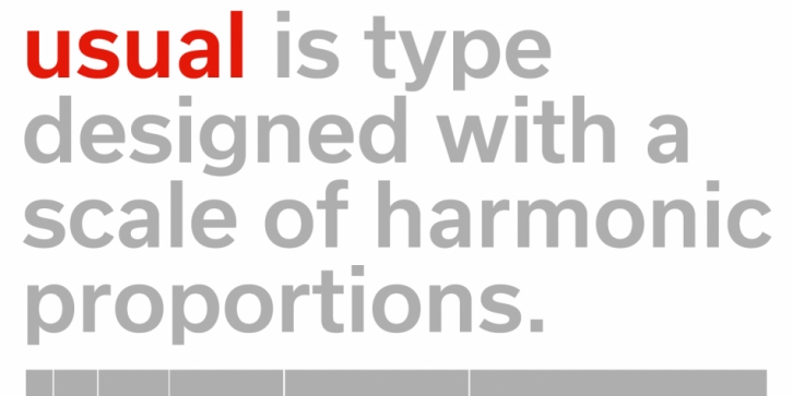

Usual is an utilitarian typeface, suitable for whenever typographic sobriety and neutrality is needed. With a clear modernist inspiration, Usual was born of the attempt at using a scale of proportions in type design.
Similarly to Le Corbusier’s Modulor, the scale of proportions used in Usual, works as a tool or program for the typeface’s metrics, and consequently, the rhythm of the stems.
Usual comprises 5 weights from Light to Extra Bold, with matching italics. It was designed to work well in a broad range of body sizes, from text settings to headlines. In addition to stylistic alternates and arrows, Usual’s OpenType features include letters with shorter descenders, useful for setting headlines with tight line-spacing.
