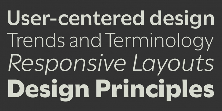
Utile and Utile Display are elegantly flared sans in two finishes suited for continuous smaller-sized text and corresponding display typography, with an overarching aim for superb legibility and optical balance. Designed with clarity and function in mind, Utile (text) features a solid letter build with carefully weighed spacing for ongoing passages of text, and form definitions compensating for trapped ink and low pixel density. Utile Display, a modulated sans, pays tribute to the contrast of thick and thin, feeling right at home in title compositions with tighter letter spacing and re-proportioned designs. The contrasted sans promotes a timeless elegance and lively aesthetic that comes especially to light in larger sizes. The slightly curved stem modulation of the Utile Collection, uniquely asymmetrical in its application, attempts to maintain a balancing act between swelled strokes and the absence of such, a feature in tune with open counters and vertical stroke ends, yielding a dynamic quality. Open Type features include figures for text and tables, stylistic alternates, fractions, and more. The ample weight scale and multipurpose variety of text and display is intended, but not limited, for contemporary identity-branding, editorial and advertising for print and screen programs.
For additional license options like app and enterprise, visit Utile on Type Network.
Kontour is a type design venture with focus on creating original typefaces. Founded by Sibylle Hagmann in 2000, the project started out with a broad spectrum of undertakings in the area of graphic, typographic, and type design. Sibylle Hagmann began her career in Switzerland at the Basel School of Design and explored her passion for anything type related in California, while completing her MFA at CalArts. During this time she developed typefaces, most notably the award winning Cholla family, originally commissioned by Art Center College of Design, and released soon after by the type foundry Emigre in 1999. Cholla was among the winning entries of bukva:raz!, the type design competition of the Association Typographique Internationale (ATypI) in 2001. The typeface family Odile, first published in 2006, was awarded the Swiss Federal Design Award in the same year. Sibylle Hagmann’s work has been featured in numerous publications and recognized by the Type Directors Club of New York and Japan. Over the years, she presented her work nationally and internationally at typography conferences and educational institutions with occasional workshops.
Supported languages: German, Spanish, Dutch, English, Polish, Russian, French, Czech, Swedish, Portuguese, Catalan, Italian, Slovenian, Maltese, Arabic, Devanagari, Greek, Gujarati, Gurmukhi, Hebrew, Chinese (hk), Japanese, Korean, Tamil, Chinese (Traditional), Chinese (Simplified), Turkish, Hungarian, Vietnamese, Bengali, Kannada, Cherokee, Thai, Armenian, Belarusian, Danish, Macedonian, Ukrainian, Norwegian, Serbian, Telugu, Malayalam, IPA, Latvian, Chinese Pinyin, Finnish, Filipino, Malay, Croatian, Kazakh, Romanian, Persian, Indonesian, Slovak, Hindi
File Size: 16.50 MB
Release date: March 23, 2020
You can use this font for:
- Design projects: create images or vector artwork, including logos
- Website publishing: create a Web Project to add any font from our service to your website
- PDFs: embed fonts in PDFs for viewing and printing
- Video and broadcast: use fonts to create in-house or commercial video content and more
- The fonts are designed to work on MacOS (Apple) and Windows (Microsoft)


