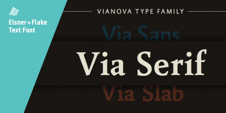

On February 26, 2014, Jürgen Adolph wrote the following:
"I was already interested in typography, even when I could not yet read. Letterforms, for instance, above storefronts downtown, had an irresistible appeal for me.
Therefore, it is probably not a coincidence that, after finishing high school, I began an apprenticeship with a provider of signage and neon-advertising in Saarbrücken, and – in the late 1980s – I placed highest in my field in my state.
When I continued my studies in communications design in Wiesbaden, I was introduced to the highest standards in calligraphy and type design. "Typography begins with writing" my revered teacher, Professor Werner Schneider, taught me. Indefatigably, he supported me during the development of my typeface "Vianova" – which began as part of a studies program – and accompanied me on my journey even when its more austere letterforms did not necessarily conform to his own aesthetic ideals.
The completely analogue development of the types – designed entirely with ink and opaque white on cardboard – covered several academic semesters. In order to find its appropriate form, writing with a flat nib was used.
Once, when I showed some intermediate designs to Günter Gerhard Lange, who occasionally honored our school with a visit, he commented in his own inimitable manner: "Not bad what you are doing there. But if you want to make a living with this, you might as well order your coffin now."
At that time, I was concentrating mainly on the serif version. But things reached a different level of complexity when, during a meeting with Günther Flake which had been arranged by Professor Schneider, he suggested that I enlarge the offering with a sans and slab version of the typeface. So – a few more months went by, but at the same time, Elsner+Flake already began with the digitilization process.
In order to avoid the fate predicted by Günter Gerhard Lange, I went into "servitude" in the advertising industry (Michael Conrad & Leo Burnett) and design field (Rempen& Partner, SchömanCorporate, Claus Koch) and worked for several years as the Creative Director at KW43 in Düsseldorf concerned with corporate design development and expansion (among others for A. Lange & Söhne, Deichmann, Germanwings, Langenscheidt, Montblanc."
Font Family:
· Vianova Serif Pro Light
· Vianova Serif Pro Light Italic
· Vianova Serif Pro Regular
· Vianova Serif Pro Italic
· Vianova Serif Pro Medium
· Vianova Serif Pro Medium Italic
· Vianova Serif Pro Bold
· Vianova Serif Pro Bold Italic
File Size: 15.55 MB
