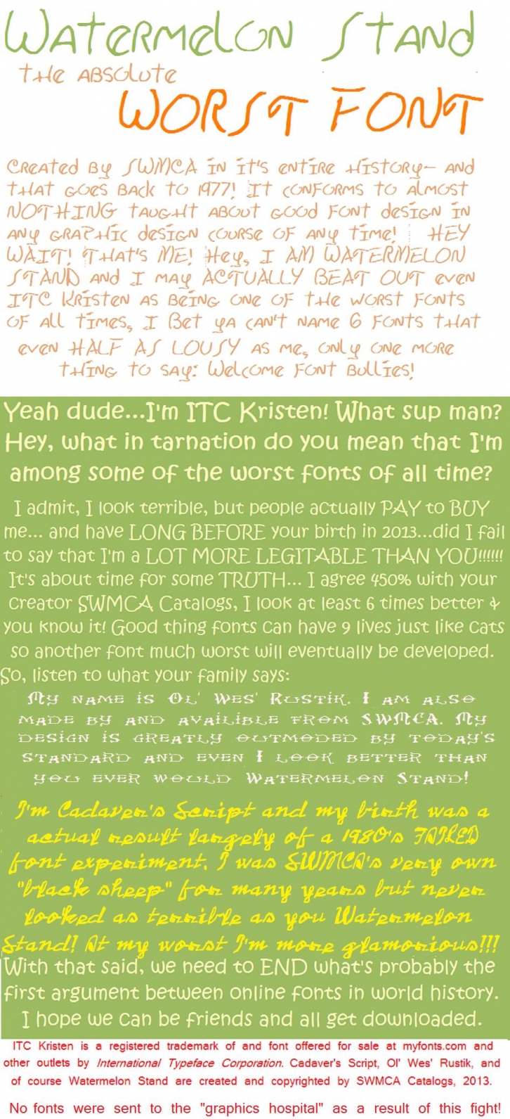
Free download of Watermelon Stand I Font. Released in 2015 by SWMCA Brands & Holding LLC. and licensed for personal and commercial-use
The font current has been updated. This a replacement for the recalled previous version. It now has 164 characters. We plan to add more. We plan to complete or do 5 more fonts too. Watermelon Stand will soon go from just being a single typeface, to becoming a typeface. Some of this work was started prior to the company's reorganization beginning in 2016. Because of our recall, replacement copies of the original font were designated as Watermelon Stand I. Once this becomes a typeface, it's individual fonts will be named by roman numerals, instead of style destinations. The additional fonts are planned to be introduced publicly from the year 2020 until 2022.
This font was inspired by the lousy writing on hand written signs at many watermelon stands in the Midwest (USA), hence the name. ITC Kristen was also a food related lousy font designed after lousy scribbles on restaurant menu boards. As with ITC Kristen and Walt Disney's handwriting which was later digitalized...along with a couple dozen other fonts of this era. Watermelon Stand is of extremely terrible graphic design...and designed that way on purpose giving it a more typical and less "rehearsed" mimic of a more average "common folks" handwritten styling.
Everything of good (or at least tolerable) penmanship is absent here. Even parents and teachers with some of Earth's worst bad writing skills would not dare use this font to teach kids how to write. Almost everything of good graphic design is gone too. The letters are more uneven than even most lousy handwriting both in font and "at the scene" written form. In addition, the only major descender of the lowercase is the "y" character. Why? [you decide!]
Usually even with people who mix caps with their lowercase letters (officially called uni-case or uncial letters, depending on the actual forms of the letters), at least the "j" and "p" are also descender characters, not here buddy. Practically all techniques of good type design went out the window with this font. Hey, what's wrong with that? Many celebrities have writing actually worst than this font and commonly with writing that's barely legible. This is the Watermelon Stand font and about as close to chicken-scratch as a font can get and still be totally readable.
The caps in Watermelon Stand were patterned somewhat by the Walt Disney handwriting which was used from the beginnings of that company and even today, many years after his death. The numbers and about half of the lowercase was created directly by my SWMCA operation, while the rest using the personal writing of the late Kelly Sheckells, who will be sorely missed (went to Heaven 2012) as a guide.
We've decided NOT to use all of Kelly's writing but only part of it as a guide for the lowercase due to the fact that the death was considered recent at the time of design and I had concerns regarding identity theft and plagiarism of her written works. While she certainly needed great help with penmanship, she was an excellent writer of poetry and other things as well as one of the best cooks in Missouri including at Arrowhead Stadium...where she actually cooked for the players of the Kansas City Chiefs along with their rivals (including the most scorned rival of all the Oakland Raiders when they were in town) and in her final years of life an organizer with ACORN and a excellent worker with the 2010 Census. It's very lonely without Kelly, whom was cherished right up to her death and even more now.
Now you see why they have calligraphy books and graphic design courses and schools! Imagine if all fonts where like this one! Can you imagine if the text in the newspaper or even on your cellphone's screen and the car's dashboard were like this? At least there IS a public service aspect.
(Seriously, WE'RE FOR REAL ON THIS ONE!)
This font can be a GREAT argument to why penmanship SHOULD be brought back to the elementary classroom. Compare it to your kids' writing. If their's is worse demand that the local school board work towards improving it by adding "writing skills" to the curriculum, and if it's better insist that you don't want your child's writing to NEVER, EVER get to the level of THIS FONT!
HINT: Hurry up before SWMCA decides to create a cursive version for the Watermelon Stand font!
Don't worry neat writing fanatics, we're fine with Watermelon Stand. There are no immediate plans for a font named "Watermelon Seed and Rind".
WARNING:
THE NEW WATERMELON STAND FONTS COMING OUT; WILL CONTINUE TO JUST AS LOUSY AS THE ORIGINAL, PROVIDING THAT THEY DON'T TURN OUT TO BE FAR WORSE!
File Size: 2.8 MB
Tags: handwriting,
messy,
bad, lousy,
uniqueRelease date: June 4, 2015
You can use this font for:
- Design projects: create images or vector artwork, including logos
- Website publishing: create a Web Project to add any font from our service to your website
- PDFs: embed fonts in PDFs for viewing and printing
- Video and broadcast: use fonts to create in-house or commercial video content and more
- The fonts are designed to work on MacOS (Apple) and Windows (Microsoft)
Preview:

