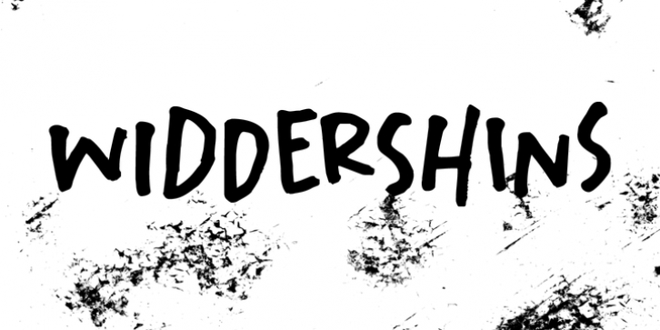
Widdershins was designed by David Kerkhoff and published by Hanoded. Widdershins contains 2 styles and family package options.
I like strange words. Widdershins is one of them: it means 'to go counter clockwise' and I picked it up from a book I am reading at the moment.
Widdershins font was created using a broken bamboo satay skewer and Chinese ink. It is a little messy, uneven and maybe even unnerving, but I am sure you'll find a way to put it to good use.
Font Family:
· Widdershins Regular
· Widdershins Italic
File Size: 20.28 MB
Tags: allcaps, bamboopen,
black,
bold, caps, chineseink,
drawing,
handdrawn,
handmade,
handwritten,
headline,
ink,
inked,
legible,
loud,
messy,
multilingual,
organic,
painted,
rough, satayskewer,
unevenRelease date: October 23, 2018
You can use this font for:
- Design projects: create images or vector artwork, including logos
- Website publishing: create a Web Project to add any font from our service to your website
- PDFs: embed fonts in PDFs for viewing and printing
- Video and broadcast: use fonts to create in-house or commercial video content and more
- The fonts are designed to work on MacOS (Apple) and Windows (Microsoft)


