Xylitol is a multiple layer typeface you can use for creating chromatic, 3D effects. It’s designed so the letters fit tightly together like Tetris blocks.
There are four directional layers for the sides so you can simulate light coming from various directions. There’s a stripe layer which can be used to created a metallic shimmer effect.
The Hollow style is made of thin outlines and has multiple uses. Use it on its own for a engineery, blueprint look. Make it black and overlay it on solid colors for a stained glass effect. Set it to 50% gray and use a screen or color dodge effect at around 25% opacity to create a subtle sharpening effect. The solid layer can be offset to simulate a drop shadow.
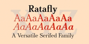
The Xylitol family includes a Solo style which has more conventional spacing—handy when you need accompanying flat text. An outline style is useful on its own of for doing layer transparency tricks. Xylitol supports lot of languages including Greek and Russian.
It’s all about experimenting but here are some tips to get you started:
• You’ll need to use an application that allows you to overlay layers of text. Every application has a different way of dealing with this but generally, you type what you want, make several overlapping copies of the layer then alter each layer’s color and style.
• Some applications, like Photoshop ignore the font’s vertical metrics so you may need to vertically shift some of the layers to align. The diamond (lozenge) ◊ character contains a registration cross-hair to help you get things lined up.
• Make sure you’re not using optical kerning in Adobe apps.
• If you’re using the front layer and all the edge layers, you might think it’s unnecessary to include the back layer. But the back layer can help obscure some of the background leaking through due to layer rendering imprecision. You might not need it but it’s there if you do.
• If you plan on including the Hollow style, I recommend using it as the first layer and checking carefully for unwanted overlaps before copying the layer. For example, the T may overlap A a tiny bit. That’s the way the typeface is designed—the priority is to have the edges set tight. You can fix the overlaps by adjusting tracking. It’s no fun if you add Hollow as the final layer, notice an overlap and realize that the tracking will have to be adjusted for each layer.
Font Family: