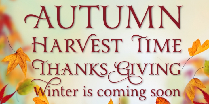

It was a sunny summer afternoon, and Yana and I had escaped the graphic design studio we worked at for lunch. We sat at an outdoor patio eating and discussing fonts. In particular, we discussed a serif face that would be so versatile, from simple to complex styling, with letters adorned with swashes we would be able use it for just about everything: we could customize it for logos and headlines and then be able to use the same font for text too – it would be a designer’s tool kit. I told Yana that as soon as I figured out how to design type, that would be one of the designs I would create – and I would name it after her. She laughed, and said, “Well, I’ll be the first person to buy it.â€
As I began sketching out this font, I was drawn to the idea of creating it with classic proportions, and as it developed, it took on an old style Victorian look, yet with a touch of modernity and friendliness.
Font Family: