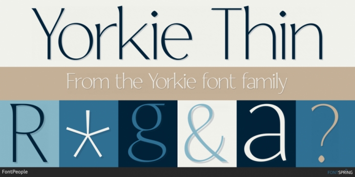
Designed by John Beltrán, Yorkie is a serif font family. This typeface has sixteen styles and was published by FontPeople.
Yorkie has significant contrasts in line thickness and triangular line terminals that are not unlike serifs, placing it somewhere between a Grotesque and Serif type family. The contrast between the features of a humanist Grotesque and an Antiqua gives the characters of Yorkie their distinctive charm and is the distinguishing attribute of this contemporary type family.
Thanks to a generous x-height and its open counters, Yorkie is also highly legible in small point sizes.
Font Family:·
Yorkie Thin·
Yorkie Thin Italic·
Yorkie Extra Light·
Yorkie Extra Light Italic·
Yorkie Light·
Yorkie Light Italic·
Yorkie Regular·
Yorkie Italic·
Yorkie Medium·
Yorkie Medium Italic·
Yorkie Semi Bold·
Yorkie Semi Bold Italic·
Yorkie Bold·
Yorkie Bold Italic·
Yorkie Extra Bold·
Yorkie Extra Bold ItalicFile Size: 12.44 MB
Release date: May 1, 2021
You can use this font for:
- Design projects: create images or vector artwork, including logos
- Website publishing: create a Web Project to add any font from our service to your website
- PDFs: embed fonts in PDFs for viewing and printing
- Video and broadcast: use fonts to create in-house or commercial video content and more
- The fonts are designed to work on MacOS (Apple) and Windows (Microsoft)


