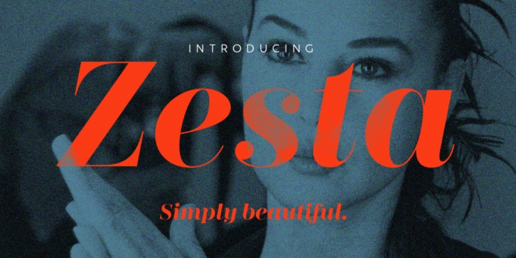

Zesta is a family of high-contrast serif fonts, intended for use in display typography. Their design is modern, or ‘Didone’ in style, meaning that its letterforms look like those used in France during the revolutionary, imperial, and restoration eras (late-1700s/early-1800s). This style of type is instantly associated with fashion and design for high-end cosmetic products. It is also used extensively in magazine design. The family includes 10 styles. There are five weights, ranging Light through Black. Each weight has an upright and and italic font on offer. The upright fonts feature letterforms drawn with vertical axes of stress. Ball terminals play a prominent design role in both the upright and italic fonts. The hairlines in all of the fonts are very thin. The thicker strokes just keep getting heavier as one moves up the weight scale, and this is the driver behind the typeface’s high-contrast design. The lowercase letters in Zesta feature a large x-height. Ascenders rise slightly above the capitals, and the default numerals are the same height as the uppercase letters. These default numerals are proportionally-spaced lining figures; however, oldstyle figures are also available via an OpenType feature. The fonts include discretionary ‘ct’ and ‘st’ ligatures, which can be accessed via an OpenType feature as well. The lowercase ‘a’ and ‘g’ are double-storey in the upright fonts and single-storey in the italics.
Font Family: