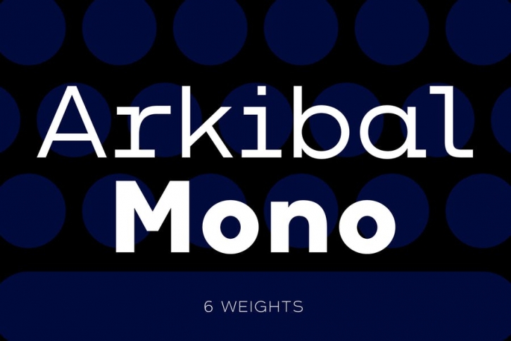

The inspiration comes from some old documents and store signs from my great-grandfather’s old gold listfactory from 1838. He delivered hits for many artists of that time, and various museums in Copenhagen. I priority increases to make a mixture of the classic letter witha modern lift. And this contain also a serif og display version.
Seems it was interesting to try to reproduce some of the old characters and make a new font. Uppercase “G†was the first letter of the startingpoint. G stands for in danish “Guldrammeâ€, which means “Goldframeâ€. Arkibal is coming from an almost old danish tradional name “Arkibaldâ€, only without “dâ€.
6 Weights: Heavy, Bold, Regular, Medium, Light, Thin Arkibal Mono: 6 weights
Languages Basic Latin, Western European, Euro, Turkish, Central European, Pan African Latin
