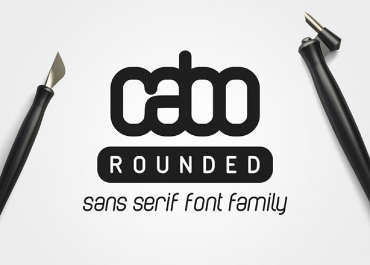

The story of Cabo Rounded begain last year, when I was redesigning my personal logo. Back in 2013, I designed the first logo for my designer profile – cabo – using Helvetica as a base.
I was pleased with it, but last year I decided it was time for an upgrade. I started playing around with shapes and strokes in Illustrator, in order to recreate my new identity, without getting too far from the original.
While working on creating characters for it, I realized that the style I was starting to create it might actually make a great font. So I started working on the rest of the letters! Within hours, the first drafts were ready! I was really happy with what I managed to create, so I started looking for a way to turn it into an actual font!
Each weight comes with an italic version of it!
You will get:
