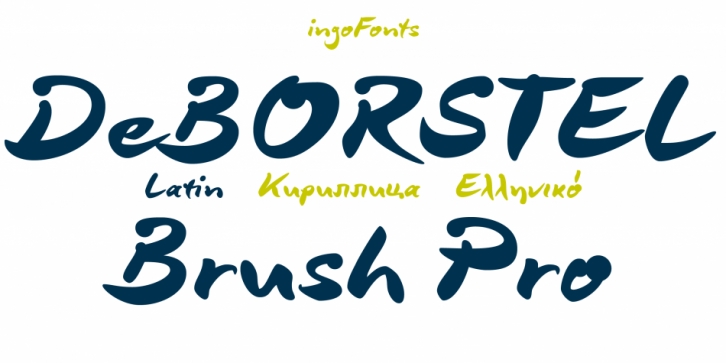

A personalized cursive written with the pointed brush
The strange name of this font means nothing other than â€brush,“ but only the Dutch understand it. The typeface is spirited, amusing and flashy. I made the handwritten original of DeBorstel Brush quickly and without interruption with a pointed brush.
In the capitals, DeBorstel Brush appears to be almost too balanced for handwriting. In contrast, the lower case letters are intentionally very individual and uneven.
A bit more life is added to the typeface with ligatures activated which are constructed with alternative letter forms – and as a result, a number of problematic letter-combinations are improved.
And if this typeface is still not lively enough for you, the additional alternative character forms a e g i j l n o s t u z are available with the Open Type-Function â€Discretional Ligatures“.
Font Family: DeBorstel Brush Pro Regular