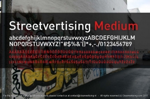
JT Energy was designed by Oliver Jeschke and published by OGJ Type Design. JT Energy contains 10 styles and family package options. The font is currently #20 in Hot New Fonts.
JT Energy is a new in 2020 interpreted geometric type with optically consistent line thickness and an interesting look and feel. This type is inspired by designs from Paul Renner and Arno Drescher and was long developed until it was something own.
The family is equipped with
7 cuts - light to heavy -
2 extra versions "Placard" to set very large
stylistic alternates with letterforms that are round-edgy
alternates with flat diacritics
standard and oldstyle figures
and a variable font
What makes this type unique is the slanted, edgy-sharp M, a new S and a wide f.
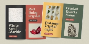
Amazingly designed for a solid appearance in a branding project, magazine, packaging, website, letterhead, business card and the daily commercial jobs.
- -
Graphic design by Salzmann Gertsch, Switzerland.
"We think the Energy has a great style and it's also fun to design with it!"
Font Family:
· JT Energy Variable
· JT Energy No. 77 Placard
· JT Energy No. 78 Placard
· JT Energy Extra Light
· JT Energy Light
· JT Energy Regular
· JT Energy Medium
· JT Energy Semi Bold
· JT Energy Bold
· JT Energy Heavy
File Size: 7.45 MB
Tags: 2020, bauhaus,
bold,
branding, business, circle o,
commercial,
contemporary,
corporate,
display, display face,
editorial,
geometric,
headline,
heavy, jobbing, logotype, magazines,
minimal,
modern,
packaging,
print, sans,
sans-serif,
screen, timeless, type,
versatile,
webRelease date: February 24, 2020
You can use this font for:
- Design projects: create images or vector artwork, including logos
- Website publishing: create a Web Project to add any font from our service to your website
- PDFs: embed fonts in PDFs for viewing and printing
- Video and broadcast: use fonts to create in-house or commercial video content and more
- The fonts are designed to work on MacOS (Apple) and Windows (Microsoft)